2020 Climate Quiz: Results and Insights 👁📊
Back in August 2020, we have launched the first official version of Planethours, the survey that within just 8 questions can tell you which actions to take to address the ongoing climate crisis 🧯🔥🌎.
Until now, thanks to all of you 🙏🏻, we have collected more than 2000 responses, which means it’s time to finally share some interesting results!
Demographics
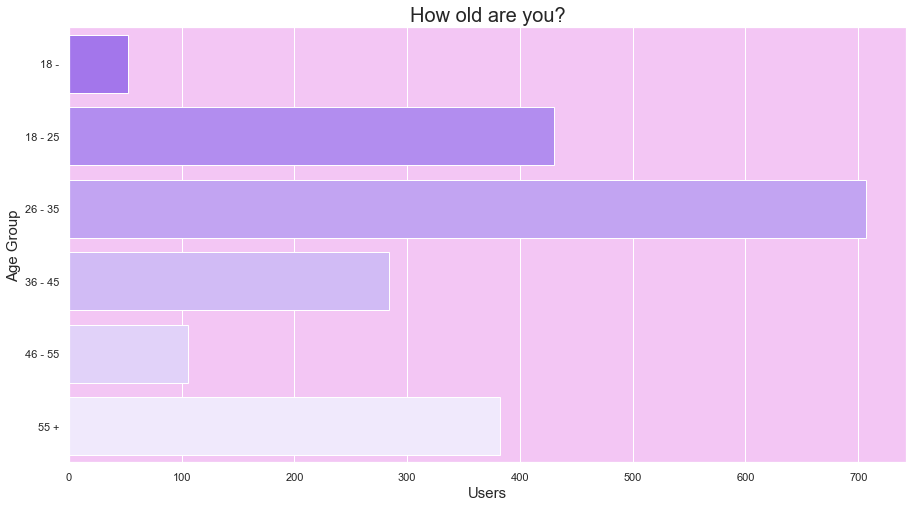
According to our estimations (based on the traffic we received on our server) the majority of the people came from Germany, although we haven’t explicitly asked for this information in the original version of the survey (the latest version of the survey includes a dedicated question about nationality*)*. We instead (optionally) asked for the age group at the end of the survey: most of the people are within the 18–35 range, but in the last months we received quite a few samples from the higher age group.
Overall Emissions
The survey asks for 8 questions about the (potentially) most impacting habits connected to CO2-equivalent emissions. For each question and answer we have an associated CO2-eq annual emission estimation (checkout our methodology to know the details).
Unsurprisingly, the greatest source of impact (not only individually, but even collectively) are the long distance flights, followed by the car usage.
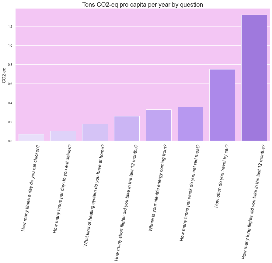
💁 Quick tip : keep intercontinental flights only for special occasions and reduce car usage (or go for electric cars).
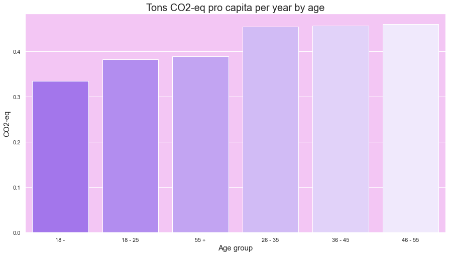
Another interesting aspect is the emission distribution per age-group: people at the extremes of the age lines (< 18 yo, > 55 yo) show a lower overall impact.
Diet
Regarding dietary habits (in particular, consumption of chicken, dairies and red meat), we expected to see a spike in red meat consumption. What we instead saw is that the majority of the people that took the survey seem to be more keen on frequent dairies consumption.
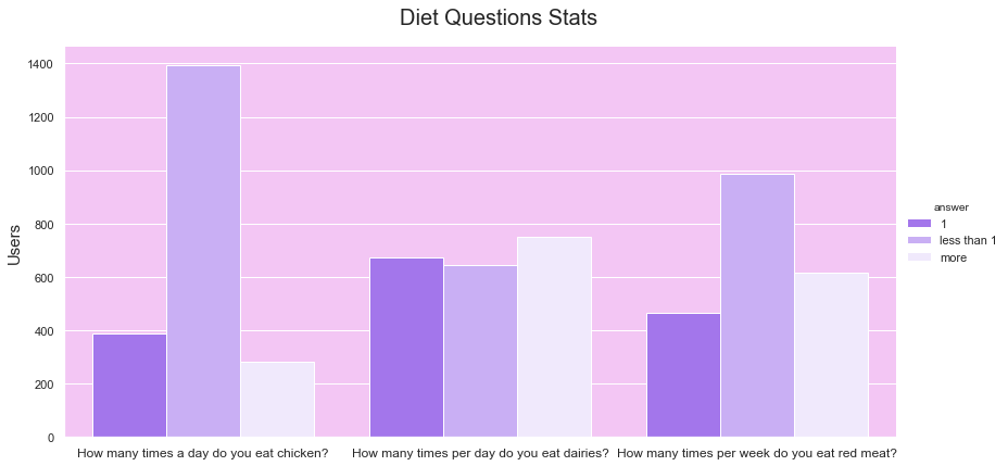
Indeed, there might be a hidden bias in this result: people that decided to take the survey could already be part of an informed group, hence skewing the data towards a more “vegetarian” type of result.
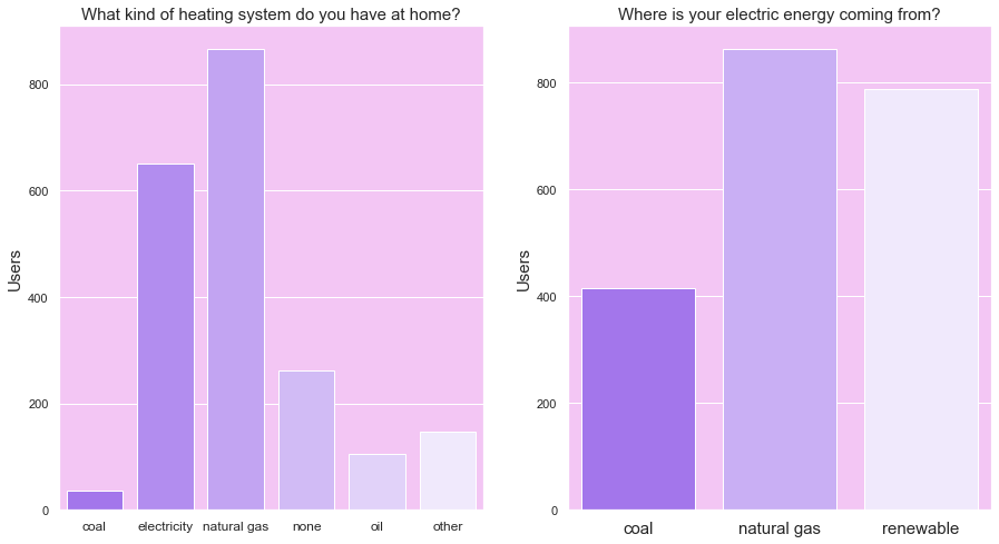
Energy
We were also mildly surprised to see how many people already converted to a renewable electricity provider, but the overall picture shows that we are still very much dependent on natural gas.
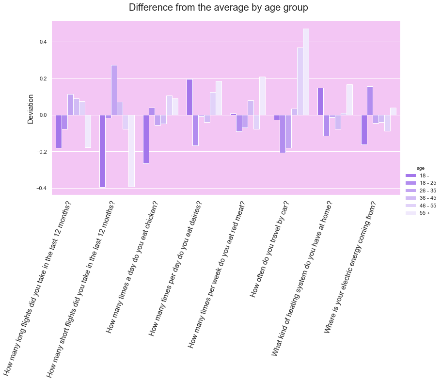
Personas
For each age group, we identified which question contributed the most to the overall group emission. What we found out:
-
👵🥩🚙 Elders (55+) are the only group showing higher than average red-meat based diet. Them, along with the 46–55 band, are also the people more dependent on the car for transportation
-
🧑✈️🧳 Short distance flights are mainly a habit of the 26–35 age group, while they are rarer for the youngest and the oldest cohorts
-
👦🐓🔥 Young people (18-) are eating relatively more chicken and have, along with the 55+ group, the most CO2-heavy heating systems in their homes
The chart below shows the deviation from the average for each question and age group:
Next steps
This data shows some insights that we collected based on a few thousand users and a couple of months of running the campaign. What we would like to achieve in the next iterations is:
-
to collect data from a broader audience
-
collect data continuously
Our final objective is to be able to provide a continuously updated and open dataset about the behavioural sustainability of the people around the world and, when we have data for a big enough time window, build a “real time” dashboard showing how the world is developing towards their zero-net emissions goal. This could help us conceiving different campaigns to sensibilise and help people on the most sensitive and actual issues, but also help other groups and institutions understand the problem in a more data-driven but still easy-to-understand fashion.
And: if you haven’t tried yet, go ahead and do the survey! We appreciate feedback and data 😀
Cheers! 🖖🌎